OZARIN Redesign: Part 1
It’s true what they say; a developer flips a coin when they decide to write an update for their blog… or build a new one.
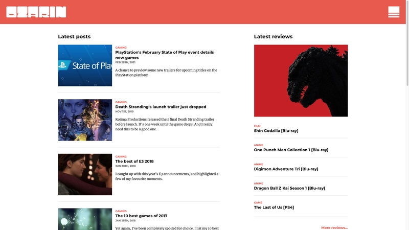
In the first of two parts, I'll discuss some of the process and ideas behind the redesign of my personal site.
Project summary
For a little background info, OZARIN is a personal project which over the years has been a reflection of my skills and interests. You can read more about the history of the project on the about page.
Specifically, OZARIN is a blogging platform to share content which I produce, whether writing, photography or podcasts. It is simple to maintain and use, which in turn allows me to focus on creating content. There is also a strong focus on performance, legibility and accessibility.
Setting targets
I set myself the timeframe of 3 months, during my free time, to redesign, build and launch a site to support my existing content. I reasoned that any sooner would require more time than I could commit, and any later could mean neglecting other projects planned for the coming year.
Within that timeframe I set smaller milestones for: Feature Parity, Build/Deploy Flow and Launch Release 1.0.
I had been hoping to use the Gatsby framework for a personal project for some time, and really take advantage of GraphQL to manage various types of content.
Competitor analysis
Whilst "competition" is maybe a stretch, I looked at four sites I enjoyed and with some similar features or content to my own.
In terms of their look and feel, most of these sites are fairly dated, but where they shine is the type of content they produce - for the most part, high quality reviews of niche media with hi-res photos and in some cases video.
I created a spreadsheet to try and better understand their service using Google's PageSpeed Insights, Accessify, and SimilarWeb to get a rough idea of audience size.
Whilst this was largely as a curiosity, I gained a few key statistics:
- Desktop speed rated between 19 - 97 (/100), with an average of 67
- Mobile speed rated between 34 - 99 (/100), with an average of 60
- Accessibility was generally quite low, with the highest ranking at 65/100
I'll likely return to this information in future, but given I have no historic data for OZARIN these figures are largely aspirational.
The old site
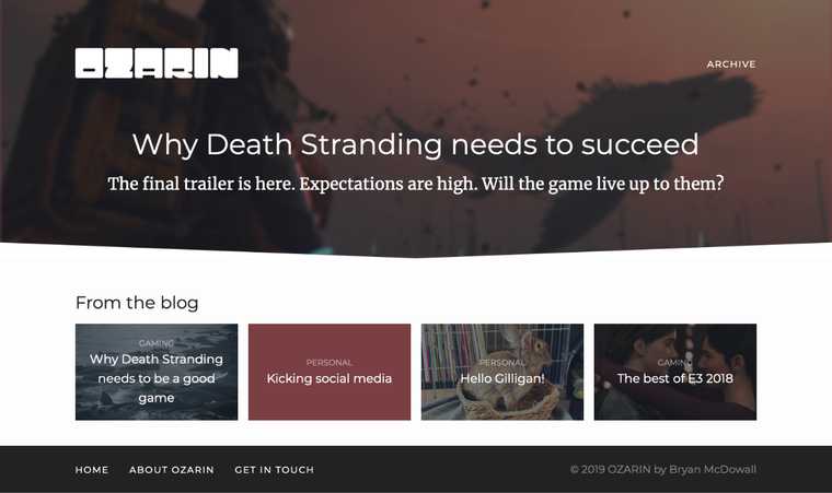
Besides suffering from a lack of recent updates, my old blog was looking a little dated.
A large header or "featured post" dominated the page for long periods of time - really emphasising how rarely I had been able to write updates, and in the case above, wasn't especially exciting to look at.
The orange colour looked washed out as a transparent overlay, making image detail harder to distinguish and overlaid text harder to read.
Existing previews weren't very engaging, and didn't say enough about the contents of a post. Furthermore, the single stream of everything offered little in the way of being able to navigate specific types of information.
Action points
From the concerns outlined above, I created a short list of key actions which would become the pillars of my redesign:
- Create more engaging previews
- Better use of colour and fonts
- Make better use of existing content and...
- Improve content discoverability
Generating ideas and planning
I used Miro to generate ideas in a mind map, and note other thoughts.
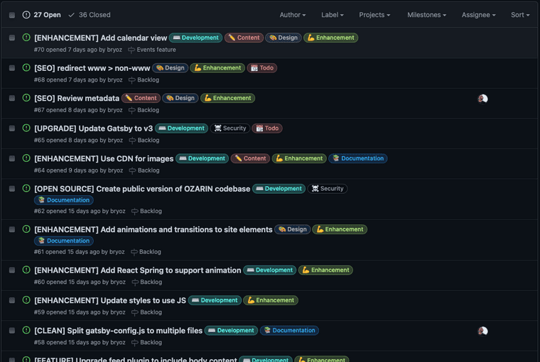
This has proven to be a great exercise for really exploring ideas over time, though it doesn't replace the need for a more structured approach to work - which I tend to use GitHub's features for.
Content is King 👑
At its core, OZARIN is a blog, utilising content in the form of posts. As such any design choices should compliment that.
I decided to pull content I had produced for other sites, including reviews for Otaku News, and a topical gaming podcast I had previously produced for the site. In future I also want to support event post types.
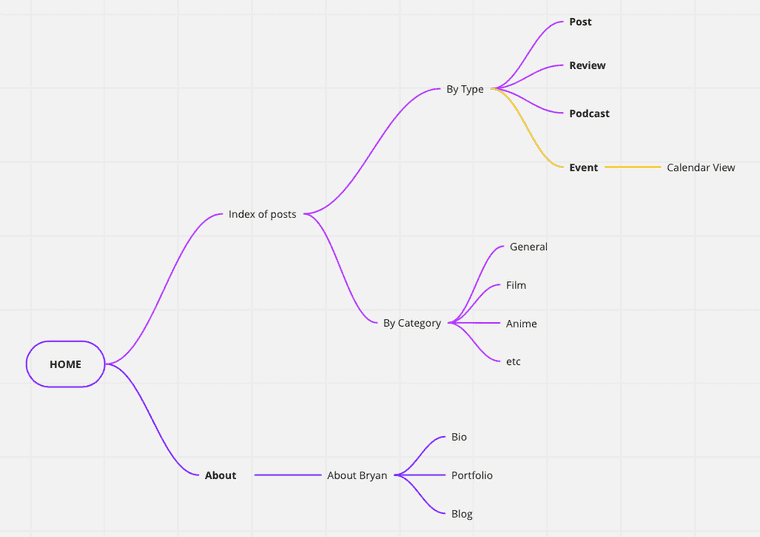
Again using Miro, I was able to design a simple architecture built around content (top level pages in bold).
Identifying different post types, gave me a starting point for designing templates.
Small changes, big improvements
I identified a few "quick wins" that would help achieve my goals...
Brand colours
I love orange! It's such a positive and optimistic colour. OZARIN has for some time had an association with the colour orange, and I see no reason to change that.
The previous shade of orange was veering towards a coral pink, so I decided to darken it a little to suit my personal tastes. This change also improves contrast and legibility against a light background, but should ideally be reserved for large font sizes to be accessibility compliant.
I chose a complimentary colour, a dark blue, for contrast. This wasn't something I had previously established, but extending the colour palette helps reduce choice paralysis when designing templates. It's likely I'll rely on this colour for a future "dark mode" also.
I created a gradient using the primary orange colour also, as in the past I have been accused of "boring" (or repetitive) use of block colours. This simple gradient gives me the option of something a little more interesting for features, or promotional graphics relating to the site.
Icons
I wanted to make the site icon less game-specific. Whilst there's something romantic about a retro game controller, it's also fairly niche and not immediately recognisable - especially at smaller sizes.
I decided I wanted something to bridge the different mediums of content I'd be sharing on the website - and after shortlisting, arrived at robots!
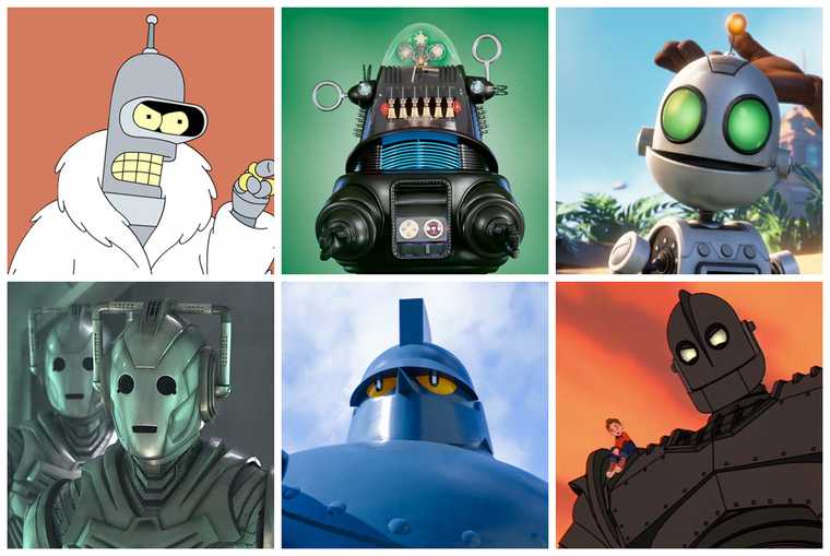
Humans are programmed to look for faces1, even mistaking them in everyday objects (face pareidolia2). So using a face, even one abstracted in the form of a robot, is something which is more recognisable than the previous controller icon.
I used simple shapes, channeling the appearance of a vintage clockwork toy, choosing to omit fine detail. I included an antenna, to create an association with transmission.

Fonts
I enjoy the combination of Merriweather and Montserrat which I had used previously, and decided to keep using them for familiarity.
I wanted to reduce the number of font dependencies I relied on. I also believe that the lighter weights of Montserrat are less legible, especially at smaller sizes. As such, it made sense to remove them from my stack, and use only the bolder version of Montserrat for page titles and other featured text.
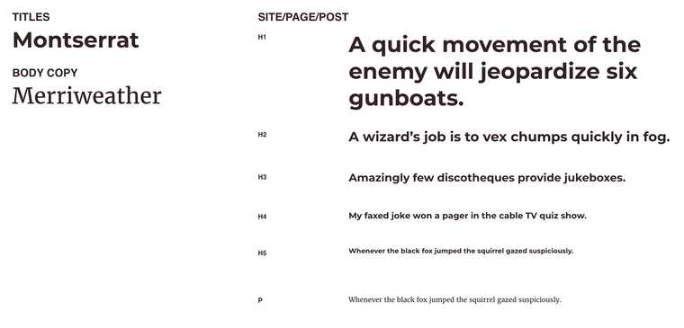
It's a much simpler approach, and gives me the added benefit of clearer text if I want to overlay it on an image or lower contrast background colour.
The templates!
Using Adobe XD, I created a fairly comprehensive set of designs for mobile, tablet and desktop (widescreen), to help me address all common devices sizes.
As the site is still in development, not all of the features detailed in the designs are currently built out.
Post preview

As a fundamental component, it was important to me that this was an improvement on the previous version.
Post
This is an important template, given that most shared links will point directly to an article or "post".
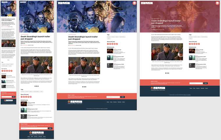
There was little change to the main body content, though I'm convinced previous simplification of font usage makes content easier to read.
I added sharing options to each post for some popular social media platforms, and related posts - which use content type and category to show more content the reader might be interested in.
At the bottom of the page there is an option to join the mailing list, and links to top level pages.
In the right-most concept, I was considering alternative header options.
Reviews
These use the same template as above, I included key information in the content meta, including things like medium (eg. dvd, blu-ray...), director, runtime, languages etc. which I'd like to incorporate into future updates to the template.
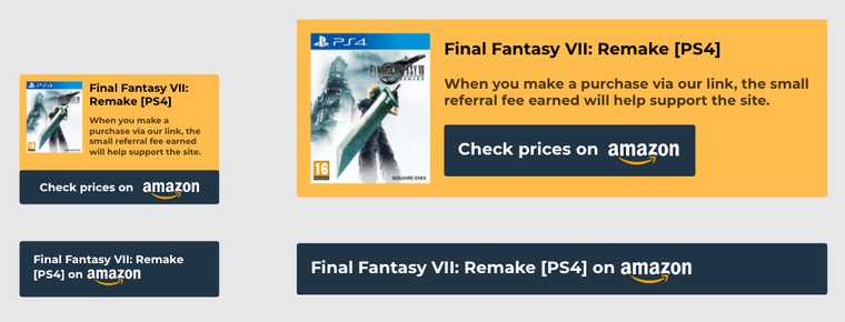
I added affiliate links to each review, linking out to the product. I wanted to ensure these were unobtrusive - appearing beneath the post content, and being clearly labeled. This is an ongoing experiment, so I'm interested in whether these will be effective.
Post index
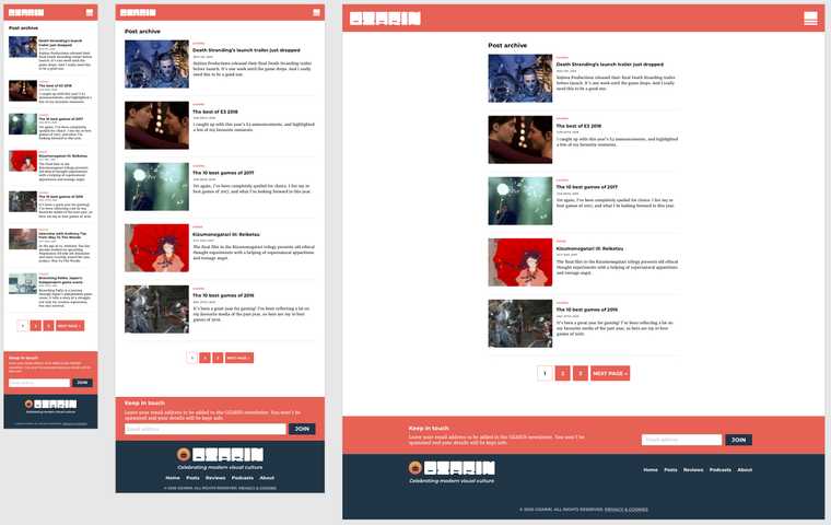
A simple page, this template returns content in the shape of post previews. It supports pagination, and is used to display posts by type and when filtering by category.
Page
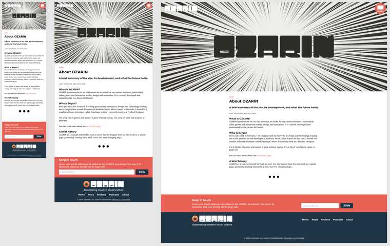
Another simple page, this is used in a largely for static content, such as the about page, and the privacy & cookies page.
Podcast
This was a fun page, and a little different from a typical post.
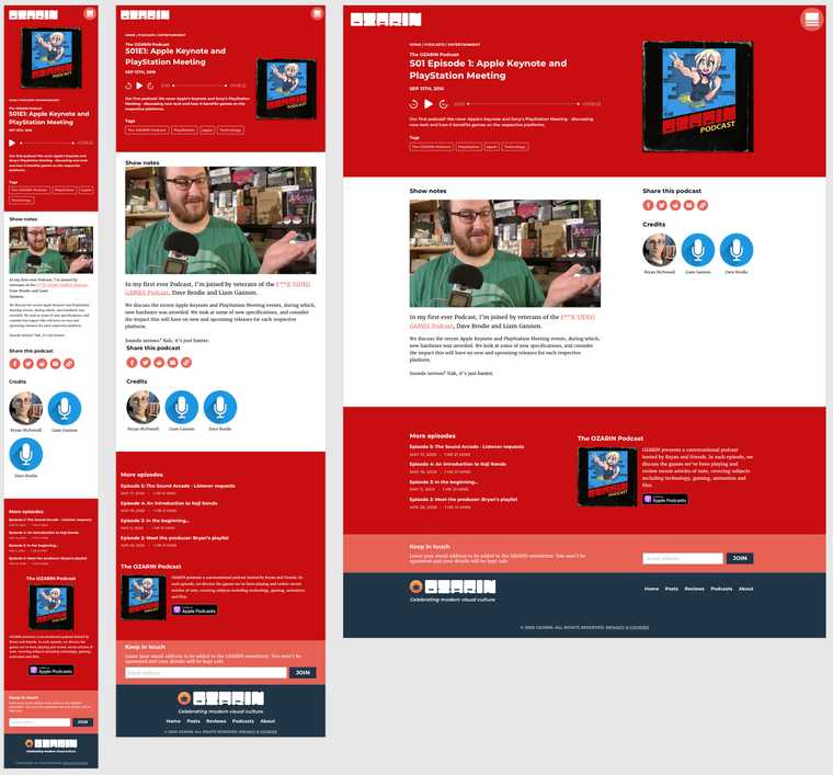
Whilst the body content is largely the same as a normal post, the header includes an audio player and series cover art. I chose to incorporate large, block colours, which are defined by each podcast series.
The hosts for each episode appear alongside the body content, and more episodes appear in the footer - alongside a summary of the show, and subscription options.
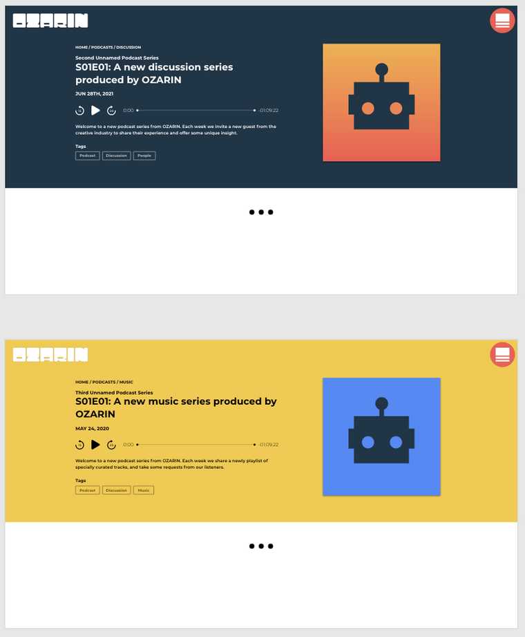
I designed a compact player also. I'd like to incorporate this at some point in the future, for people who want to listen to an episode directly on the website.

The intention would be to dock this to the bottom of the page, allowing a visitor to navigate freely without interrupting the audio track.
Podcast index
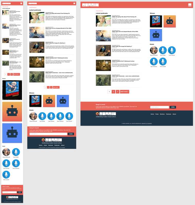
The podcast index differs from the generic post index by including shows (which would be used to filter this list) and hosts.
...Portfolio?
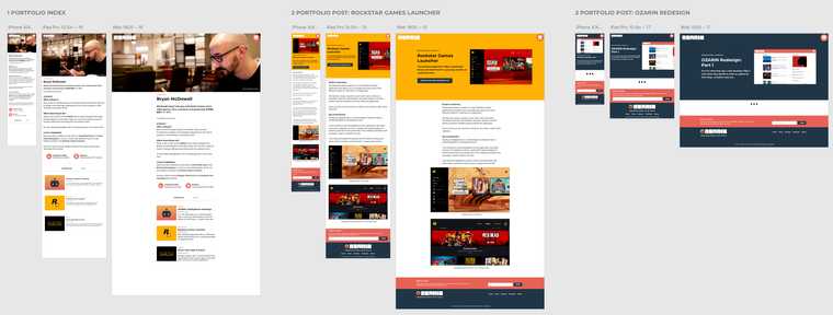
Whilst these are largely unrelated to the main body of the site, it's convenient for me to host my portfolio and resume here.
Homepage and navigation
Approaching the homepage last allowed me to take into account all of the existing content designed until now.
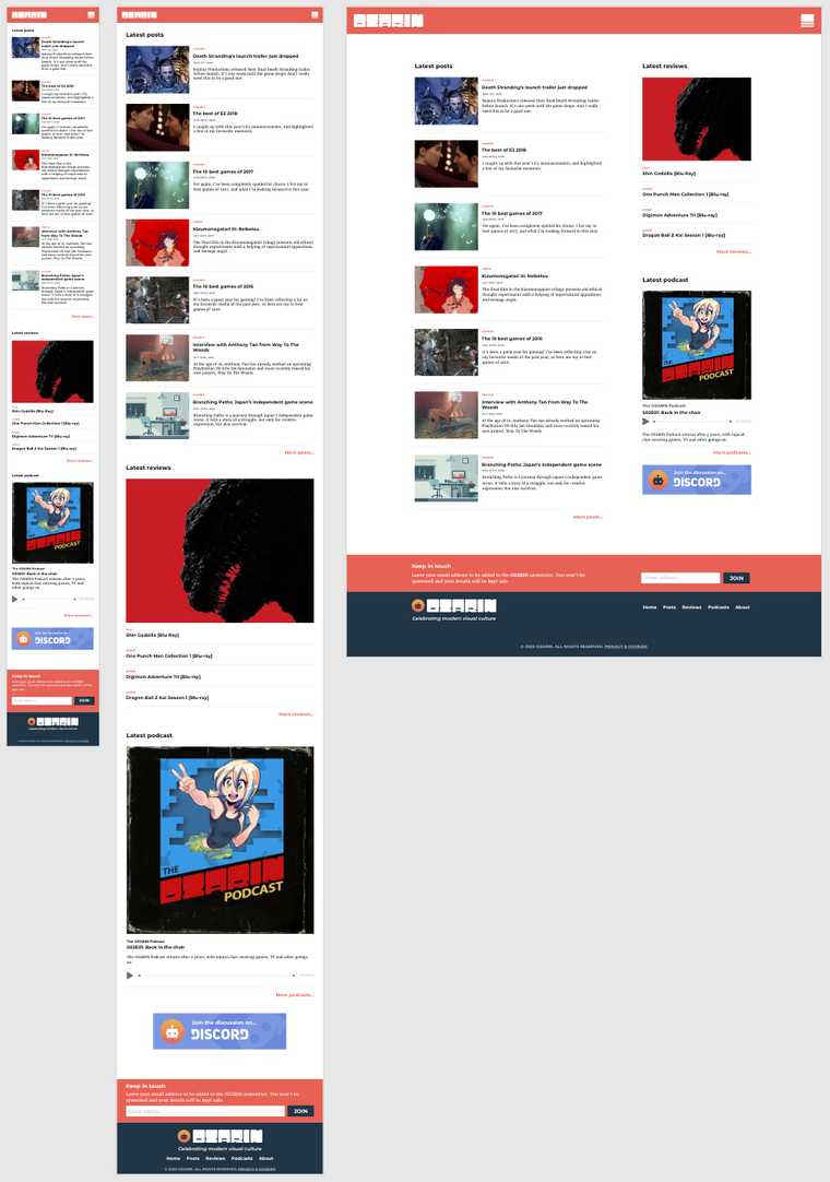
I created a stream for each type of content; posts, reviews and podcasts - and in each case, include a link to the complete index.
Because I didn't want to make the homepage overly repetitive, I opted to use a single feature image for the latest review, and a list of subsequent review titles and media types. I also chose the latest podcast episode, alongside a player and the series cover image - offering immediate recognition to followers of that series.

The menu icon was designed specifically to compliment the OZARIN logo text proportions, whilst still being recognisable as a "hamburger" navigation icon.
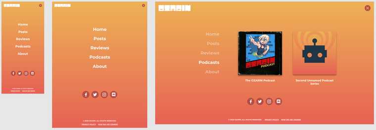
This type of navigation works well on mobile and tablet devices especially. It made sense that this would work well on desktop also, though there are conflicting arguments3.
At larger screen sizes, it would be possible to introduce additional content to this menu, such as post categories, podcast series or even selected posts.
If you've made it this far, thanks for reading!
I'm always more than happy to elaborate or answer questions about my work (where possible). Please feel free to reach out via Twitter (@bryoz) or through the OZARIN Discord server.
Coming in Part 2
I'll take a look at the challenges I faced when using a new framework to build out the site, and some of the new features I've been able to take advantage of with Gatsby.
